Shigella Data From CDC
This was part of a project I was working on about an outbreak of Shigellosis cases among HIV positive men during the summer of 2019. The full code, along with some of the public data is available on my Github. The project didn’t really go anywhere beyond this, but it was interesting developing a script that pulled all the data automatically.
Call the CDC’s API for the data
Data last updated on 2020-06-13Our first step will be to download the weekly NNDSS data for Shigellosis across the past few years. The WONDER tables provide data by the week, but we’ll be using the CDC’s API to access the annual NNDSS tables. The data.gov API uses Socrata, so you’ll need the RSocrata package to download the data yourself.
Each year has it’s own table, which I found by searching
Shigella. Unfortunately, this means you have to recode some of the
variables on a year to year basis. For example, the District of Colombia is coded
as DISTRICT OF COLUMBIA in 2019, but is DIST. OF COL. in prior years. The API
also returns data for non-states (e.g. Guam) and the sums for regions (e.g. Middle
Atlantic). For simplicity, I’m only going to pull the data from:
- Each of the 50 US states
- The total cases
- The District of Colombia
- New York City (The state of New York excludes cases in NYC in it’s count)
### ---- 2019 Data ---- ###
data2019 <- "https://data.cdc.gov/resource/ew98-twec.csv" %>% read.socrata() %>%
  # Select only shigellosis data (plus other relevant variables)
  select(reporting_area, mmwr_year, mmwr_week, contains("shigellosis")) %>%

  # recode variables to make them consistent across the years
  mutate(reporting_area = recode(reporting_area, "TOTAL"="UNITED STATES")) %>%

  # Select only US states + total (ignore regional sums)
  filter(reporting_area %in% c(state_names, "UNITED STATES",
                               "NEW YORK CITY", "DISTRICT OF COLUMBIA")) %>%

  # Make data tidy by adding variable for shigella
  mutate(pathogen = "Shigellosis") %>%

  # Rename variables and put them in order
  select(reporting_area:mmwr_week, pathogen, weekly_cases=shigellosis_current_week,
         cum_thisYear=shigellosis_cum_2019, cum_lastYear=shigellosis_cum_2018,
         max_past52weeks=shigellosis_previous_52_weeks_max)
Because this is a lot of code, I’m not including code for the rest of the years here, but the full code for this can be found on my Github.
Here’s what the 2019 data frame looks like:
glimpse(data2019)
## Rows: 2,756
## Columns: 8
## $ reporting_area  <chr> "IOWA", "ALASKA", "NEW YORK", "IDAHO", "DELAWARE", "F…
## $ mmwr_year       <int> 2019, 2019, 2019, 2019, 2019, 2019, 2019, 2019, 2019,…
## $ mmwr_week       <int> 1, 1, 1, 1, 1, 1, 1, 1, 1, 1, 1, 1, 1, 1, 1, 1, 1, 1,…
## $ pathogen        <chr> "Shigellosis", "Shigellosis", "Shigellosis", "Shigell…
## $ weekly_cases    <int> NA, NA, 2, NA, NA, NA, 18, NA, 1, NA, NA, 3, 1, NA, N…
## $ cum_thisYear    <int> NA, NA, 2, NA, NA, NA, 18, NA, 1, NA, NA, 3, 1, NA, N…
## $ cum_lastYear    <int> 2, 2, 1, NA, NA, 7, 9, 1, 2, 3, NA, 6, NA, 5, 1, 11, …
## $ max_past52weeks <int> 7, 2, 25, 6, 1, 50, 43, 1, 11, 3, 2, 21, 6, 17, 14, 1…
Now we’ll join all of these together. We’ll also use the MMWRweek package to translate the MMWR date format (MMWR week, MMWR year) to the actual calendar day, month, and year:
### ---- Join the data frames --- ###
shigella <- bind_rows(data2019, data2018, data2017, data2016, data2015) %>%
  as.tibble() %>%
  unique() %>%
  rename(year=mmwr_year) %>%
  mutate(date = MMWRweek::MMWRweek2Date(MMWRyear = year,
                                        MMWRweek = mmwr_week,
                                        MMWRday  = 7)) %>%
  select(reporting_area, date, everything()) # reorder vars

# Remove old df
rm(data2019, data2018, data2017, data2016, data2015)
National trends
To begin, we’ll looks cumulative annual cases across the United States by year.
Note: You would normally expect to see a cumulative year-to-date count of cases to always have a positive slope and increase in a step-wise fashion (because you can’t have a “negative” case). The WONDER tables from CDC do not always follow this pattern, so occasionally the cumulative YTD count will actually go down. This occurs when previously reported cases are deleted, as explained by the WONDER tables user guide:
The cumulative case count also reflects cases deleted from the cumulative total because the reporting jurisdiction’s case investigations found that the cases did not meet criteria for reporting and publication
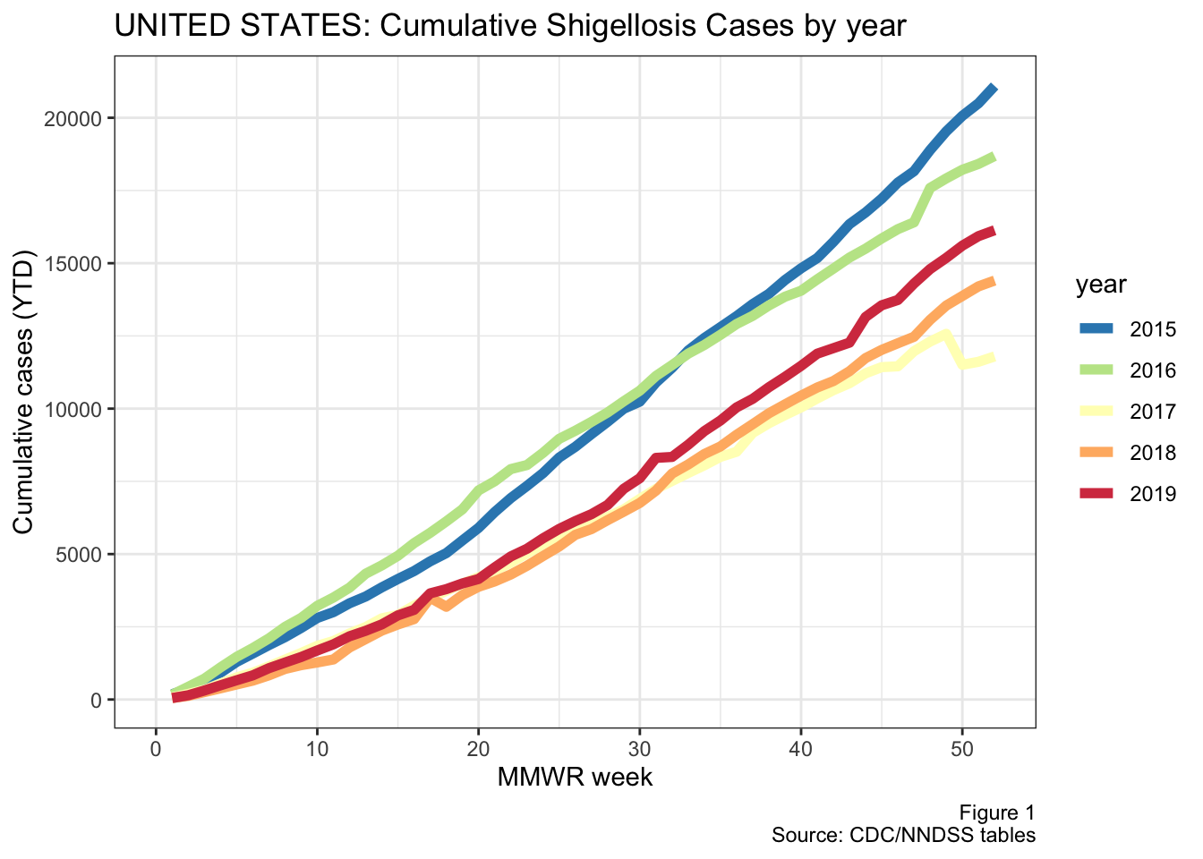
Figure 1: Annual national shigellosis cases
2015 and 2016 were bigger years for shigellosis, although I’m not sure if there have been any changes in how cases are reported during this time. The reason I mention this is that there is a sharp drop off at the end of 2015, as illustrated in the next figure below.
This figure tracks the weekly number of shigellosis cases that have been reported nationally since 2015. The grey line in the background represents the smoothed conditional means.
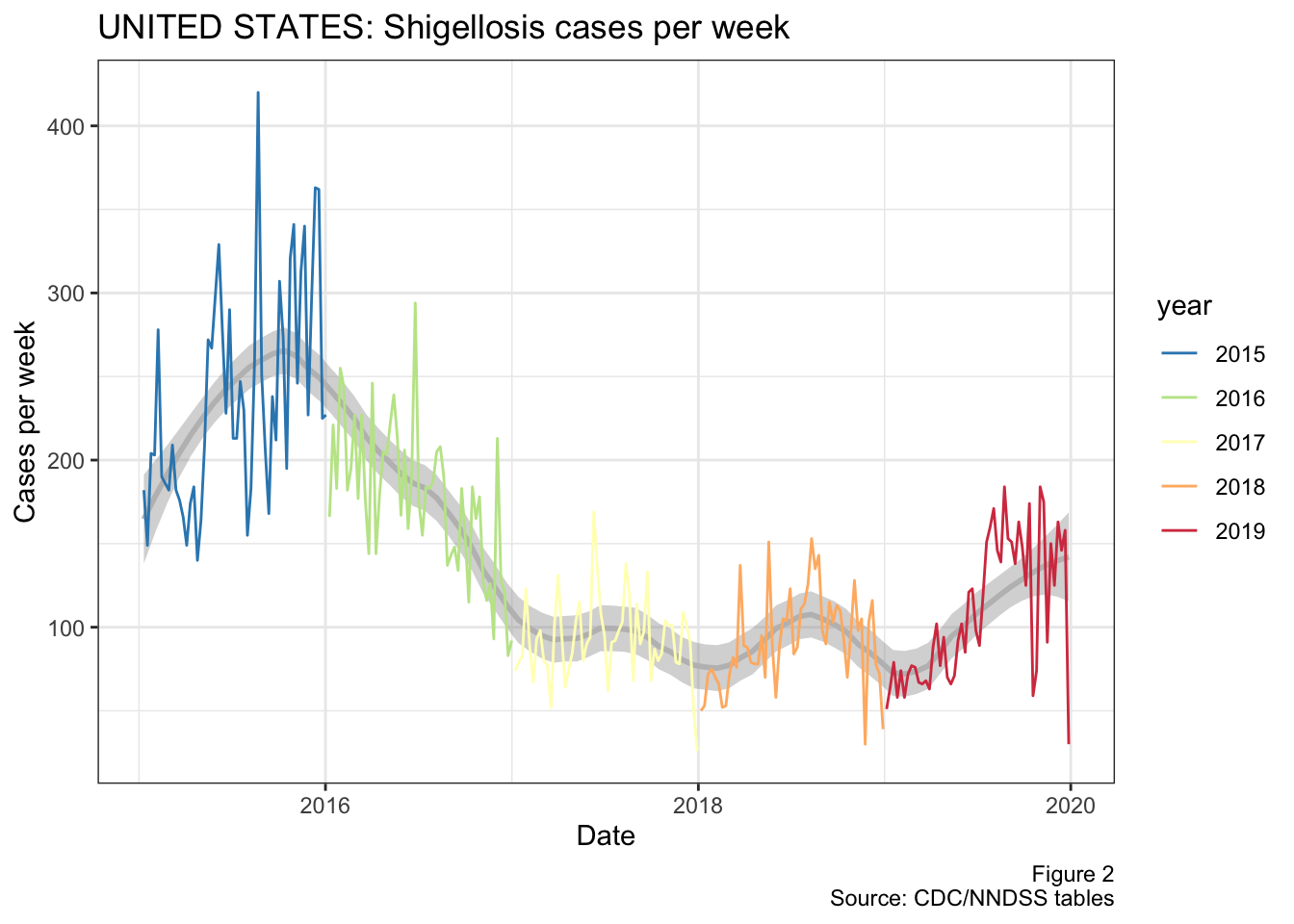
Figure 2: National cases of shigellosis per week from 2015 to present
Now what does stand out in this figure is the recent uptick in shigella cases during 2019. I guess we’ll have to wait and see if this is signal or noise, but it certainly supports our experience of having more cases of shigellosis recently.
As we’ll see below, a large driver of this apparent increase in cases comes from Texas itself, as we account for a large proportion of shigella cases (and US population).
Regional, divisions & state trends
Get census data
To look at the trends on a state level, we’ll need to adjust our dataset to match the Census/ACS format instead of the CDC/WONDER table format. This will mostly consist of adding together the data from NYC and NY state and joining the data with GEOID’s from the census.
First we’ll add together the reporting areas NEW YORK CITY and NEW YORK. Then we’ll add some identifers like abbreviated state names (e.g. TX) and the census divisions.
shigella.states <- shigella %>%
  mutate(reporting_area = recode(reporting_area,   # Make NY = NYC + NY
                                 "NEW YORK CITY"="NEW YORK")) %>%
  filter(reporting_area!="UNITED STATES") %>%      # ignore total counts
  group_by(reporting_area, date, year, mmwr_week, pathogen) %>%
  summarise(
    weekly_cases = sum(weekly_cases, na.rm = T),
    cum_thisYear = sum(cum_thisYear, na.rm = T),
    cum_lastYear = sum(cum_lastYear, na.rm = T)
  ) %>%
  ungroup() %>%
  rename(state_name=reporting_area) %>%
  mutate(state_name = str_to_title(state_name)) %>%

  # Add abbreviated state names & census divisions
  left_join(tibble(
    state_name = c(datasets::state.name, "District Of Columbia"),
    state_abb  = c(datasets::state.abb, "DC"),
    state_div  = c(as.character(datasets::state.division), "South Atlantic")
    ))
For this portion, I’ll use the tidycensus package to call the 5-year summary ACS estimates of population per state via table B01003. This also gets the shapefiles for each state, so we can make maps later
require(tidycensus)
require(sf)
require(leaflet)

population_sf <- get_acs(geography = "state", year=2017, cache_table=T,
        variables = c(population="B01003_001"), # table = "B01001",
        shift_geo=T, geometry = TRUE, survey="acs5")

population_sf$NAME <- str_to_title(population_sf$NAME)

# Save data
population_sf %>% write_rds("geoData/population_sf.RDS")
Now we’ll add the population data to our table of state data, so we can calculate per capita cases later on
shigella.states <- shigella.states %>%
  left_join(tibble(
    GEOID      = population_sf$GEOID,
    state_name = population_sf$NAME,
    Pop        = population_sf$estimate
  )) %>%
  select(state_abb, GEOID, date:cum_lastYear, everything(), Pop)
State trends
To begin, we’ll make a table of cases per year by state. We’ll also add two columns:
annual_avg_cases: The average number of annual cases per yearannual_avg_IR: The average incidence rate (IR) across the years (per 100,000)
state_avg <- shigella.states %>%
  group_by(state_abb, state_div, state_name, Pop, year) %>%
  summarise(annual_cases = sum(weekly_cases, na.rm = T)) %>%
  mutate(
    annual_avg_cases = mean(annual_cases),
    annual_avg_IR    = (annual_avg_cases/Pop)*100000
  ) %>%
  spread(year, annual_cases) %>%
  arrange(desc(annual_avg_IR)) %>%
  ungroup() %>%
  mutate(
    rankTotal = (max(row_number(annual_avg_cases)) - row_number(annual_avg_cases) + 1),
    rankIR    = max(row_number(annual_avg_IR)) - row_number(annual_avg_IR) + 1) %>%
  select(state_abb, annual_avg_cases:`2019`, rankTotal, rankIR, everything())
Now we’ll plot the individual graphs for some states. Since showing all 50 states would be overkill, let’s look at the top 15 states by their (historical) incidence rates. The Y-axis here is still in the raw number of cumulative cases, but is scaled individually for each plot.
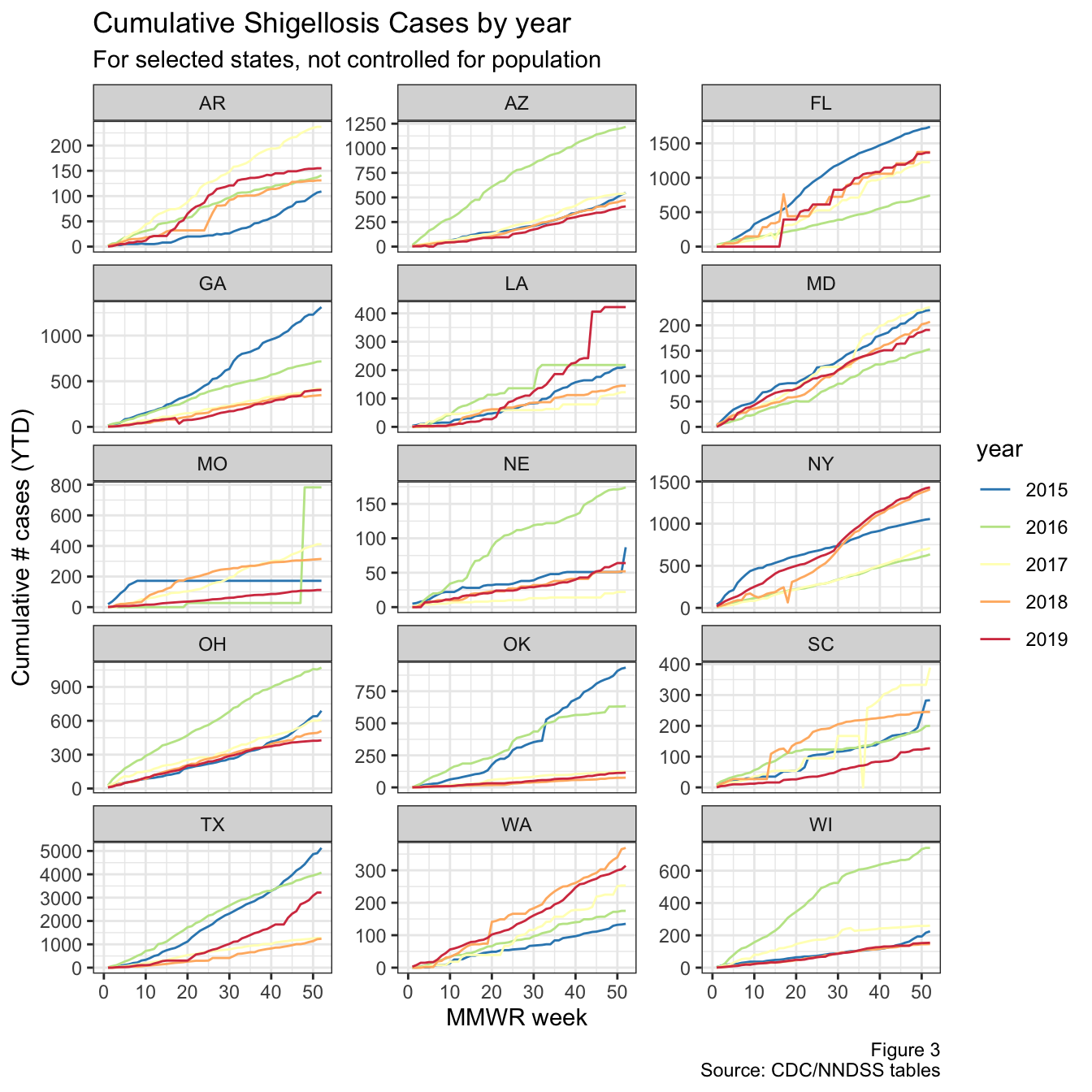
Figure 3: YTD cases for top states
Around week 20, there’s an uptick in cases nationally, and in Louisiana, Texas, Florida, NYC (not shown), and California (also not shown). Arkansas also looks like it might have had a bit of an uptick around week 15.
To see this better, we’ll look at the trend in weekly cases over the past few years (similar to the national graph shown earlier), but instead broken down by state and controlled for population.
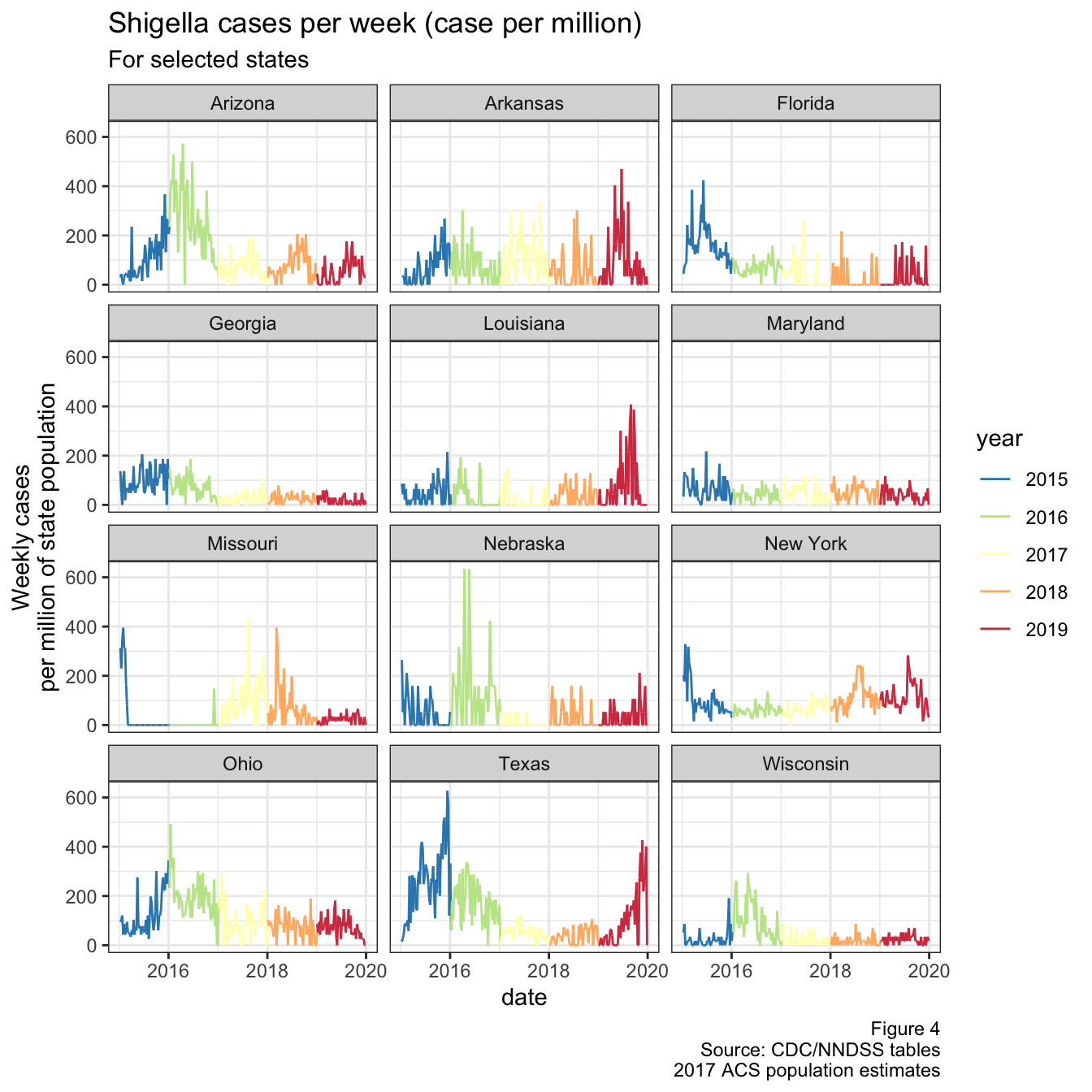
Figure 4: Weekly cases per million population
I had to exclude Oklahoma from the graph above, because they had a massive spike in cases during 2015 and it was throwing the scale off. Interestingly, this was around the same time that Texas saw it’s spike, as shown below in Fig 5. They actually line up quite well when you transform the y-axis by a square root
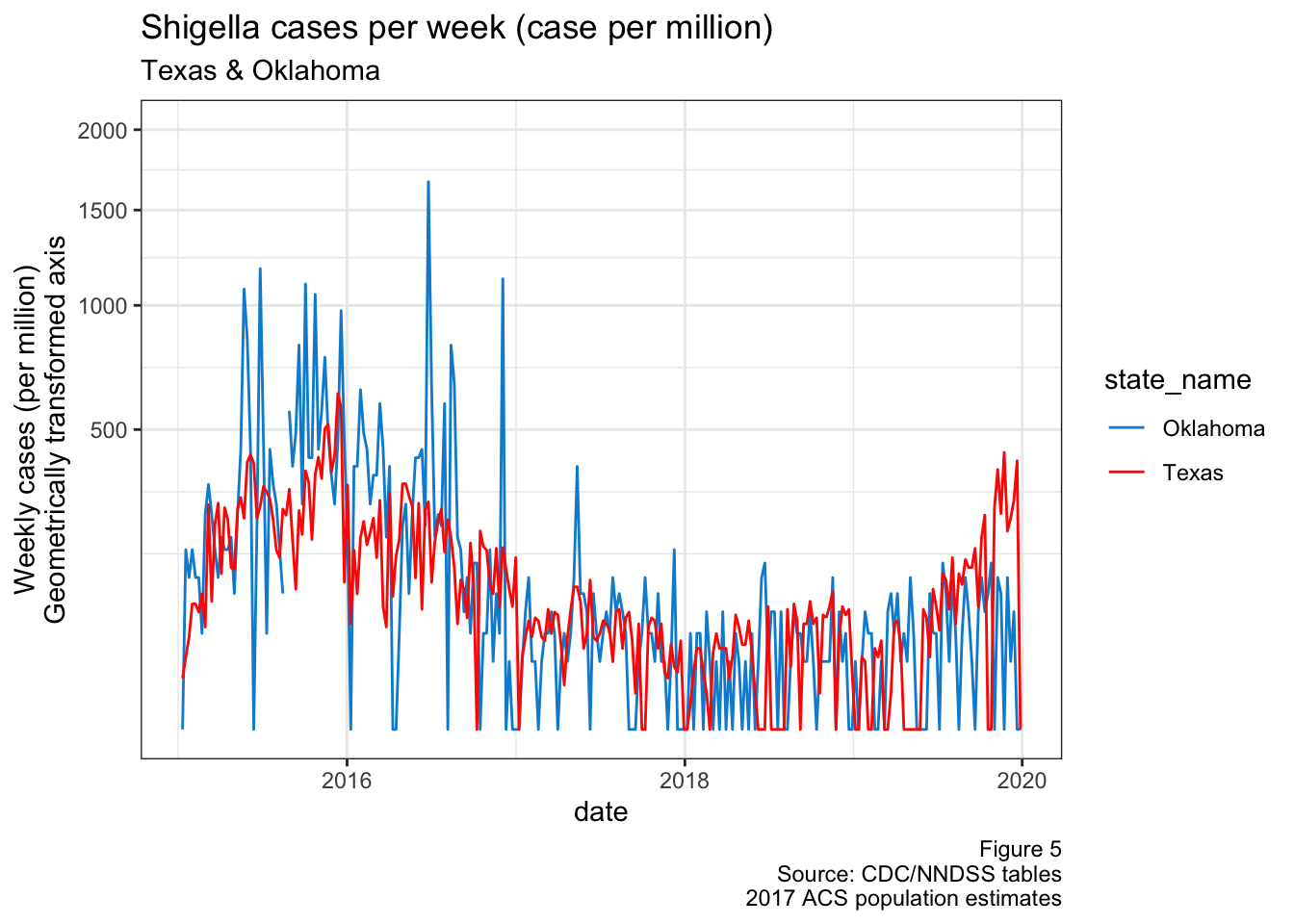
Figure 5: TX & OK cases over time
In another report, I looked at the distribution of where Shigella cases happened in Texas. It’s not related to our project, but this spike in Oklahoma cases happened around the same time there was an apparent outbreak in the Texas panhandle (see DSHS)
Division trends
Texas, Louisiana, and Arkansas are all in the same geographical area (the West South Central division of the US), so let’s just focus on this region. The figure below shows the weekly cases for each of these four states
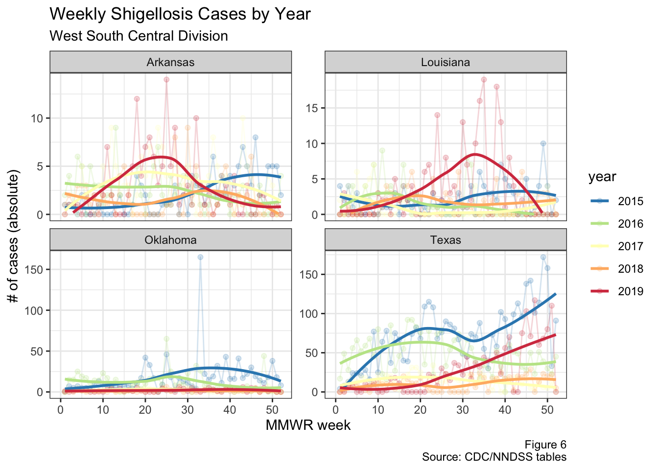
Figure 6: West South Central division cases by year
Note that the scales differ on each one of the graphs in the figure above. It’s clear that there appears to be an increase in cases during 2019, but it’s hard to tell exactly what’s going on given some of these states have a low base rate and differing population sizes. I’ll try to tackle these problems below.
Figure 7 requires a bit more explanation, as it’s calculating the fold increase in weekly incidence rates This is essentially the incidence rate standardized to each states’ historical incidence rates (similar to standardized incidence/mortality ratios). For clarity I’ve put an explanation of the math below, but you can just skip to figure 7 if you like.
To explain how I got the figure 7 data, take a hypothetical state with the example data below:
| Year | Cases | Population | IR |
|---|---|---|---|
| 2015 | 4 | 2 | 2.0 |
| 2016 | 3 | 2 | 1.5 |
| 2017 | 4 | 2 | 2.0 |
| 2018 | 4 | 2 | 2.0 |
| 2019 | 12 | 2 | 6.0 |
This state has a population of 2, and I’ve already calculated the incidence rate
(IR) on that table. Taking the median across all rows we get a historical
median IR to be 2. We then take the difference from the historical
median (IR - median_IR) to find each row’s change from the historical
median. Finally, the fold change is the Diff_from_median / median_IR, which
is what I have on the y-axis. This gets us this table:
| Year | Cases | IR | median_IR | Diff_from_median | Fold_change |
|---|---|---|---|---|---|
| 2015 | 4 | 2.0 | 2 | 0.0 | 0.00 |
| 2016 | 3 | 1.5 | 2 | -0.5 | -0.25 |
| 2017 | 4 | 2.0 | 2 | 0.0 | 0.00 |
| 2018 | 4 | 2.0 | 2 | 0.0 | 0.00 |
| 2019 | 12 | 6.0 | 2 | 4.0 | 2.00 |
So that’s how I derived the data for the next figure. Because the denominator of the y-axis can’t be zero, I had to exclude all states who had a median number of zero cases per week since 2015. I’ve also only included states who have had less than 5 weeks of being in the “top 10” states nationally during 2019, because we’re interested in outbreaks that are sustained over time
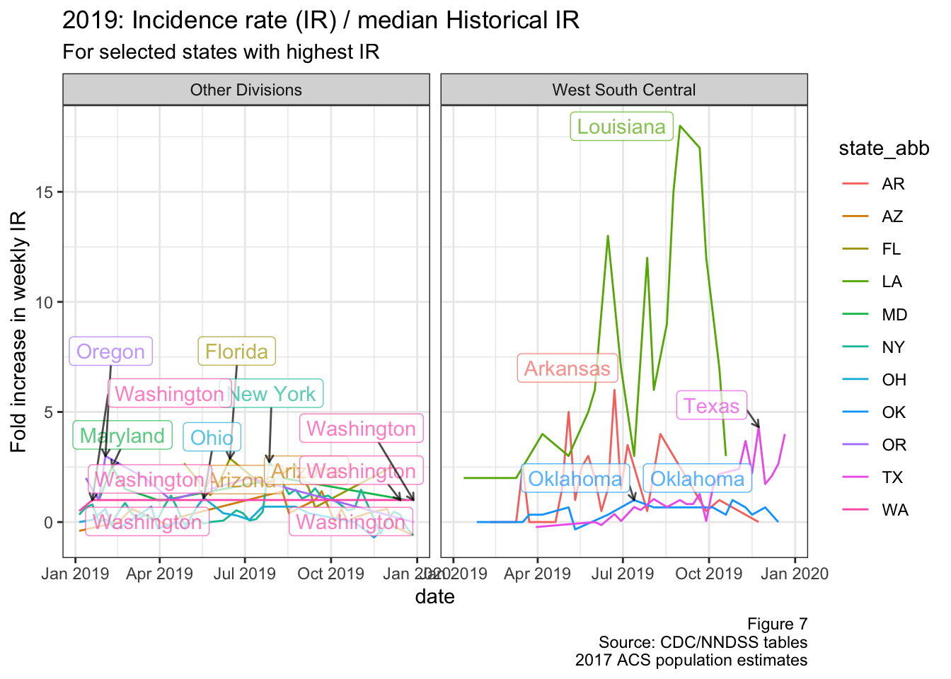
Figure 7: Fold change in IR (2019)
Interactive graphs
Below are interactive figures that you can use to look at the weekly cases by state. The first graph shows the absolute number of cases, and the second shows the incidence rate (in weekly cases per million population in the state).
The graphs can be filtered by individual state or division
widgetframe::frameWidget(ggplotly(gg, dynamicTicks = TRUE))Same as above, but cases per million (i.e. incidence rate)
S. flexneri more common in males
Another interesting point comes from the CDC’s National Enteric Disease Surveillance report. In their most recent report in 2016, they detailed the distribution of Shigella cases by species across age/sex. On page 12 they have the table for S. flexneri, which looks very different than the tables for other species
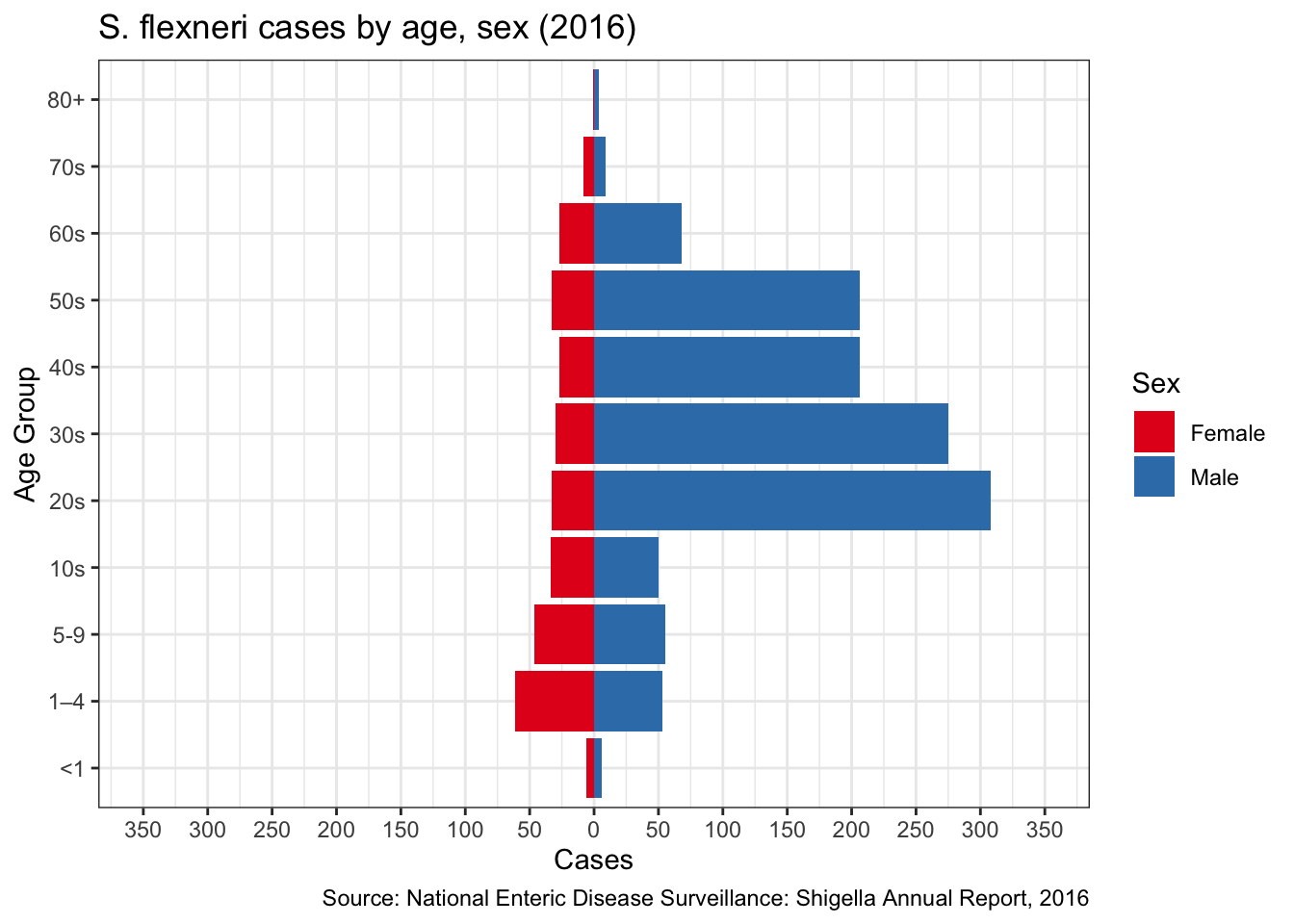
Figure 8: S. flexneri pyramid
Compare this with S. sonnei:
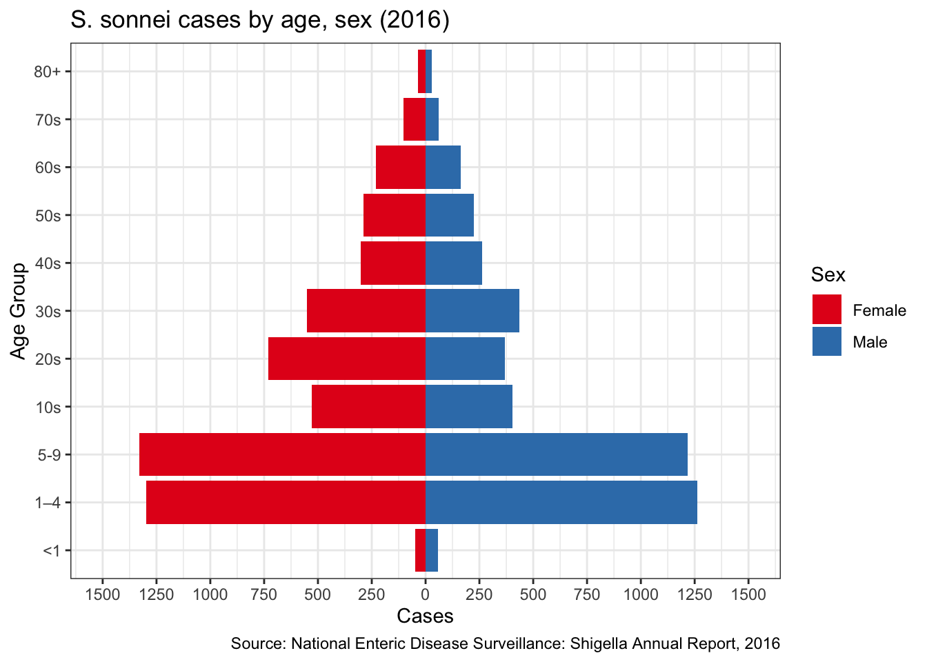
Figure 9: S. sonnei pyramid